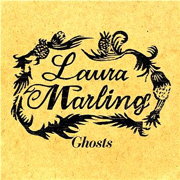
This is Laura Marlings cover for her single, "Ghosts", the genre is folk, she also plays an acoustic guitar. The album cover is fairly simple, as it just features the artists name with a simple black design around it, and the album name underneath, only two colours are used throughout the cover; black and yellow, the use of a yellow background, softens the black font and also the tone of the yellow creates a vintage feel to the cover. The album cover, features no images of the artist herself, therefore it leaves the audience feeling intrigued as to who she is, therefore it may lead to the audience wanting to find out more, as they listen to the music, it creates a sense of mystery to the artist, however this could suggest that her audience already knows who she is, therefore she does not need to have her photo of the front of the alubm cover, because people are already familiar with her. The font, is quite detailed and intricate, it also adds to the overall vintage theme of the cover, and adds a point of interest, which make up for the lack of visuals on the cover. The artists name, album name and the design, is situated within the middle of the cover, therefore our attention is drawn automtically towards the design, however the simplicity of the cover also makes us more focused on the detail.
This album cover, suggests that the audience that Laura Marling would attract, would be mainly female, because of the delicate, intricate and feminine detailing on the album. It also suggests, that the type of bands and solo artists, this audience would listen to other than Laura Marling, would be of the alternative, folk, indie genre, such as; Bon Iver, She&Him and Bombay Bicycle Club. I also think that this type of album would appeal between the ages of; 16 and 24.


This is the album cover for the artist, Kate Walsh and this is her album, "Tim`s House". The cover features a photograph of Kate Walsh, so we instantly know who the artist is, and are given an inight into her own personal style and persona, through her image. The album and artist name are written side by side, underneath the image, at the bottom of the album cover. The artists name is in bold, however the album name is not, they are both is the same small size font, written in plain black font, this focuses our attention on the photograph, rather than the details.
The photograph, uses a light colour palette and her style is also very natural, which is in keeping with the genre, however her black coloured top, stands out from the light bleached out background. The way she is dresses in dark clothes, makes her as a character seem mysterious.
The location, of an old cobbled street in this album cover is important because it relates to the genre of the music, being folk. I think this appeals to Kate Walshs target audience, because this is perhaps somewhere that this collection of people would socialise or shop, in these older areas of cities and towns.
The back cover of the album, is very much the same in comparison to the front cover, as it features the same image of Kate Walsh, however it has been bleached out, therefore it is slightly less visible than the one on the front cover. The use of repeating the photograph, makes the image rememerable, it also adds to the simplicity, yet effectivness of the cover. The same font and colour scheme, has also been used on the back cover. The song titles, have been placed in the centre at the bottom of the back cover, and the theme that has been used with the font using one colour one side and another the other side, has been carried on, with the song titles. The repetitive and simply nature that this album cover portrays, has been used in a very effective and clever, as it is very easily recognisable.
This album cover represents the audience, as the same sort of age group as Laura Marling, that being around the 16 -24 age range. I think because this album is not within the mainstream genre, the album cover definatly confirms this and would appeal to a more alternative audience.


This is Ellies Goudlings second album, "Bright Lights". This album cover, features a photograph of the artist, the aritsts name and the album name. The photograph of Ellie Goudling, dominates the album cover, however unlike Kate Walsh`s album cover, she is not looking directly at the camera, therefore we can not see her whole face, and the way she is moving her hair around suggests that she has a bubbly personality and is fun loving, it also re-iterates to the audience that she has not been consumed by this `celebrity culture` that we live in, on the other hand it does present her as being part of this culture, however she has not being fully consumed by the culture in todays society.
The back cover of the album, features the song titles, which have been arranged in the centre and making use of the whole length of the album cover. The font that has been used, is the same as that used on the front cover and is also the same colour. The colour of the font, being a light yellow with emphasis around it, to look like lights are behind it, which relates to the album title, "Bright Lights" and the background images on both the front and back covers, because of the heavy emphasis on lights and colours related with lights such as; yellow and orange.
The pastel colour palette, and bleached out effect, goes well with the genre of the music. The dispersed light across the image, works well with the name of the album, becasue of it being called, "bright lights", and the emphasis of lights within the album cover. The colours and the photograph, creates a very natural feel, which creates connotations of the folk, alternative and indie style. Although this album is an alternative genre of music, i do believe that this artist appeals to a larger audience than most alternative artists.
In my own designs, i am going to use the type of drawn design that has been used on Laura Marlings album cover, as opposed to a photograph of the artists. I have decided to use this technique, instead of using a photograph because it represents the artists as having a sense of creativity and individualism. Another aspect that i will use is the use of muted, light colours which has been used in all of the album covers, i think this connotes femininity. I will take inspiration from the font in the laura marling cover, because it is very delicate.
The artists i have chosen to analyse are similar to Shannon Hurley, because they are all of a similar musical genre; folk, alternative, acoustic.


