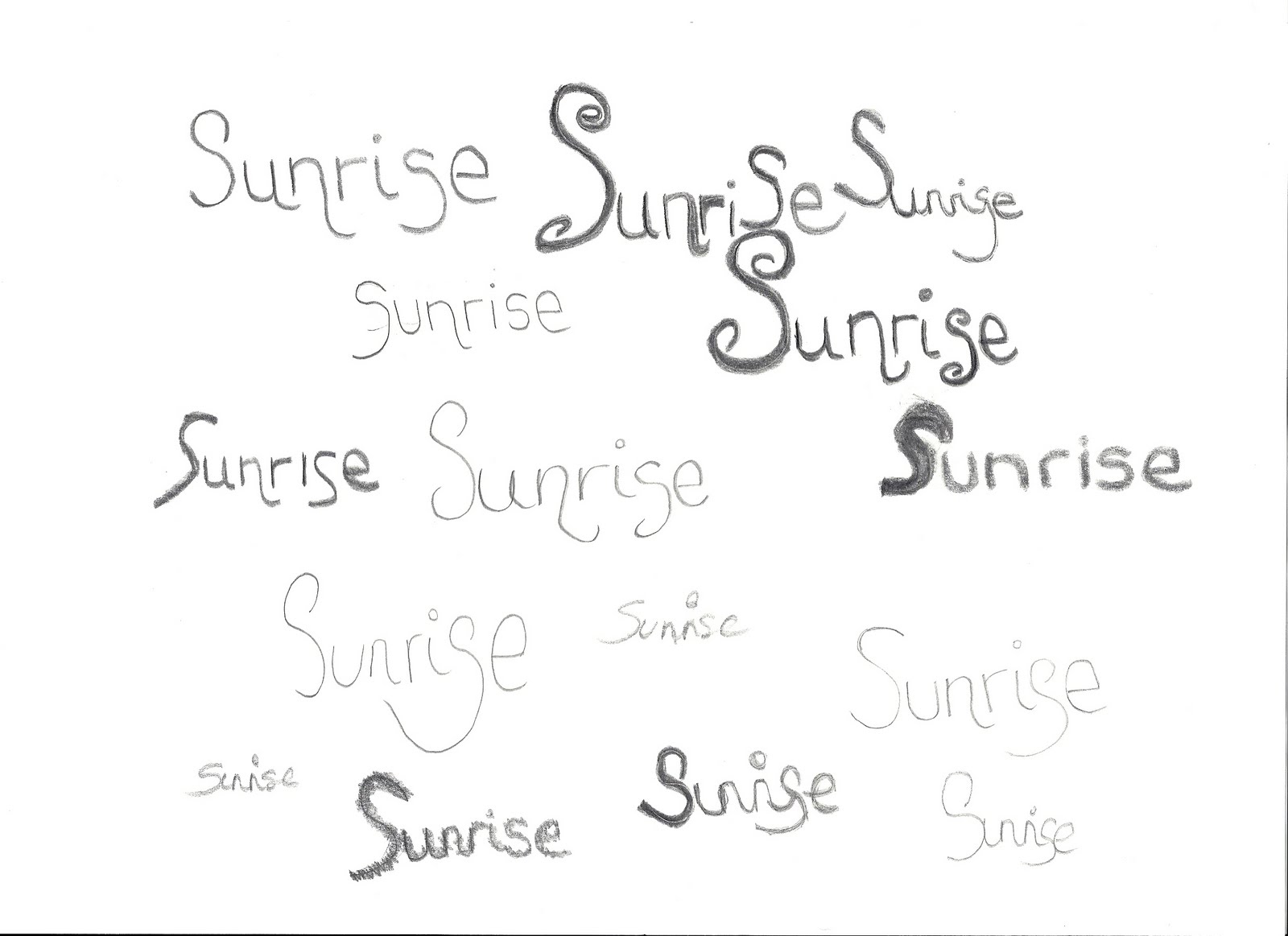
Font designs for my album cover. All of the fonts i have designed have used a curly style of writing within them, the fonts all use thin lines, i designed them this way because i thought they look more feminine and delicate this way, however on the second page of designs, a few of the fonts do feature thick lines, i think this demonstrates how with the use of thick lines, the font can look quite masculine and harsh. I like the design, in which i have elongated one of the letters and created a stem, with a flower at the end, i like the idea of adding in extra detail and small images within the font, as it creates a more interesting effect, and would work well with the genre of the music.


No comments:
Post a Comment